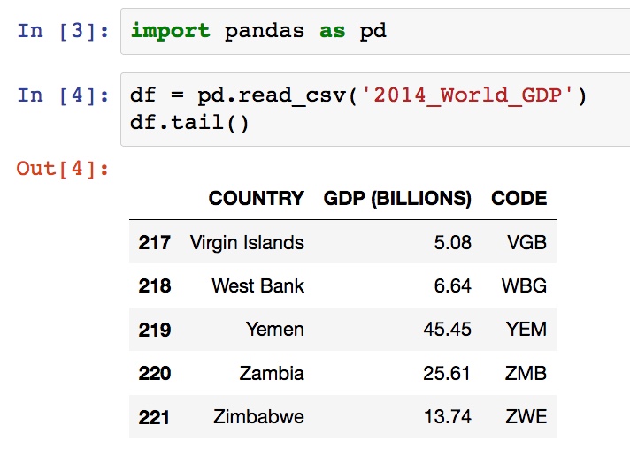
With a polished data exploration skills set and data that I can see and understand, I need to create and build comprehensive and understandable visualizations.
For data visualizations, I had focus on:
📌 Plotly
📌 Cufflinks
📌 Geographical Plotting - Choropleth Maps
What new skills have you learned?
Plotly
- Plotly is a library that allows you to create interactive plots that you can use in dashboards or websites (you can save them as html files or static images).
Install using pip install plotly
Cufflinks
- Cufflinks connects plotly to pandas
- Some of the plots one can create using Cufflinks and iplot();
-
scatter bar histogram -
box spread surface -
ratio heatmap bubble
-
Install using pip install cufflinks
Geographical plotting / Chloropleth Maps
Now you need to begin by building a data dictionary.
Easiest way to do this is to use the dict() function of the general form:
type = 'choropleth',
locations = list of states
locationmode = 'USA-states'
colorscale=
Example:

data = dict(
        type = 'choropleth',
        locations = df['CODE'],
        z = df['GDP (BILLIONS)'],
        text = df['COUNTRY'],
        colorbar = {'title' : 'GDP Billions US'},
      )
Create the layout nested dictionary:
layout = dict(
    title = '2014 Global GDP',
    geo = dict(
        showframe = False,
        projection = {'type':'Mercator'}
    )
)
With the data and layout in place use go.Figure(data = [data],layout = layout)
to set up the object that finally gets passed into iplot()
choromap = go.Figure(data = [data],layout = layout)
iplot(choromap)
What has been easy?
With the love I have for interactive plotting this was fun and we got along well.
Plotly visualizations bring out a nice touch to otherwise would be plain vizs.
Cufflinks was utterly very new to me but there are good documentation from the maintainers.
Chloropleth maps are simply darlings. With the right focus in data exploration the possibilities are enormous
What has been difficult?
For some reasons beyond me, iplots seemed not to work because of deprecated
packages in my system.
Getting my offline plot was an issue as;
In[]:   cf.go_offline()

out[]:  IOPub data rate exceeded.
        The notebook server will temporarily stop sending output
        to the client in order to avoid crashing it.
        To change this limit, set the config variable
        `--NotebookApp.iopub_data_rate_limit`.
Plotly’s mapping can be a bit hard to get used to at first remember to reference the cheat sheet or find it online here.
How have you used the problem solving strategies to overcome challenges so far?
Resolved to scrap, and clean data on Mobile-cellular telephone subscriptions.
from this dataset, I took on a couple of countries mainly from East Africa.
The explorations 📇 and plotting was done on E.Africa mobile_subscriptions notebook.
It’s a milestone getting this far 👷 and for the next one I’ll be woking on a capstone project.
So that was the third week.. 🔏