Principal Component Analysis
PCA is just a transformation of your data and attempts to find out what features explain the most variance in your data
Import Libraries
import numpy as np
import pandas as pd
import matplotlib.pyplot as plt
import seaborn as sns


%matplotlib inline
Load Data
Let’s work with the cancer data set since it had so many features.
from sklearn.datasets import load_breast_cancer
cancer = load_breast_cancer()
cancer.keys()
dict_keys(['data', 'target', 'target_names', 'DESCR', 'feature_names'])
df = pd.DataFrame(cancer['data'],columns=cancer['feature_names'])
df.head(3)
| mean radius | mean texture | mean perimeter | mean area | mean smoothness | mean compactness | mean concavity | mean concave points | mean symmetry | mean fractal dimension | ... | worst radius | worst texture | worst perimeter | worst area | worst smoothness | worst compactness | worst concavity | worst concave points | worst symmetry | worst fractal dimension | |
|---|---|---|---|---|---|---|---|---|---|---|---|---|---|---|---|---|---|---|---|---|---|
| 0 | 17.99 | 10.38 | 122.8 | 1001.0 | 0.11840 | 0.27760 | 0.3001 | 0.14710 | 0.2419 | 0.07871 | ... | 25.38 | 17.33 | 184.6 | 2019.0 | 0.1622 | 0.6656 | 0.7119 | 0.2654 | 0.4601 | 0.11890 |
| 1 | 20.57 | 17.77 | 132.9 | 1326.0 | 0.08474 | 0.07864 | 0.0869 | 0.07017 | 0.1812 | 0.05667 | ... | 24.99 | 23.41 | 158.8 | 1956.0 | 0.1238 | 0.1866 | 0.2416 | 0.1860 | 0.2750 | 0.08902 |
| 2 | 19.69 | 21.25 | 130.0 | 1203.0 | 0.10960 | 0.15990 | 0.1974 | 0.12790 | 0.2069 | 0.05999 | ... | 23.57 | 25.53 | 152.5 | 1709.0 | 0.1444 | 0.4245 | 0.4504 | 0.2430 | 0.3613 | 0.08758 |
3 rows × 30 columns
PCA Visualization
As it is difficult to visualize high dimensional data, we can use PCA to find the first two principal components, and visualize the data in this new, two-dimensional space, with a single scatter-plot.
Before this though, we’ll need to scale our data so that each feature has a single unit variance.
from sklearn.preprocessing import StandardScaler
scaler = StandardScaler()
scaler.fit(df)
StandardScaler(copy=True, with_mean=True, with_std=True)
scaled_data = scaler.transform(df)
PCA with Scikit Learn
uses a very similar process to other preprocessing functions that come with SciKit Learn.
- Instantiate a PCA object,
- find the principal components using the fit method,
- Apply the rotation and dimensionality reduction by calling transform().
We can also specify how many components we want to keep when creating the PCA object.
from sklearn.decomposition import PCA
pca = PCA(n_components=2)
pca.fit(scaled_data)
PCA(copy=True, iterated_power='auto', n_components=2, random_state=None,
  svd_solver='auto', tol=0.0, whiten=False)
transform this data to its first 2 principal components.
x_pca = pca.transform(scaled_data)
scaled_data.shape
(569, 30)
x_pca.shape
(569, 2)
We’ve reduced 30 dimensions to just 2! Let’s plot these two dimensions out!
plt.figure(figsize=(10,6))
plt.scatter(x_pca[:,0],x_pca[:,1],c=cancer['target'],cmap='coolwarm' )
plt.xlabel('First Principal Component')
plt.ylabel('Second Principal Component')
Text(0,0.5,'Second Principal Component')
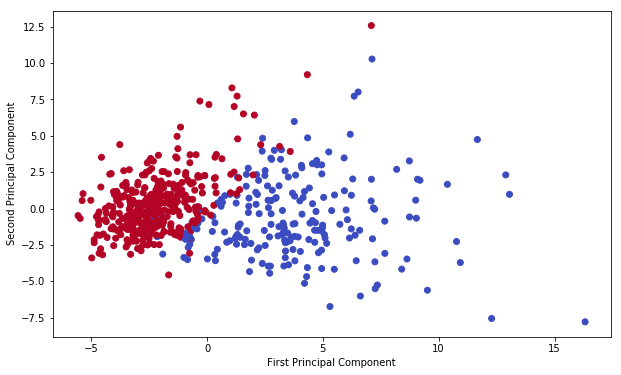
Clearly by using these two components easily separate these two classes.
Interpreting the components
Unfortunately, with this great power of dimensionality reduction, comes the cost of being able to easily understand what these components represent.
The components correspond to combinations of the original features, the components themselves are stored as an attribute of the fitted PCA object:
pca.components_
array([[ 0.21890244,  0.10372458,  0.22753729,  0.22099499,  0.14258969,
         0.23928535,  0.25840048,  0.26085376,  0.13816696,  0.06436335,
         0.20597878,  0.01742803,  0.21132592,  0.20286964,  0.01453145,
         0.17039345,  0.15358979,  0.1834174 ,  0.04249842,  0.10256832,
         0.22799663,  0.10446933,  0.23663968,  0.22487053,  0.12795256,
         0.21009588,  0.22876753,  0.25088597,  0.12290456,  0.13178394],
       [-0.23385713, -0.05970609, -0.21518136, -0.23107671,  0.18611302,
         0.15189161,  0.06016536, -0.0347675 ,  0.19034877,  0.36657547,
        -0.10555215,  0.08997968, -0.08945723, -0.15229263,  0.20443045,
         0.2327159 ,  0.19720728,  0.13032156,  0.183848  ,  0.28009203,
        -0.21986638, -0.0454673 , -0.19987843, -0.21935186,  0.17230435,
         0.14359317,  0.09796411, -0.00825724,  0.14188335,  0.27533947]])
Each row above represents a principal component, and each column relates back to the original features.
Visualize the relationship using a heatmap
The relation exist between PCA and original features
df_comp = pd.DataFrame(pca.components_,columns=cancer['feature_names'])
df_comp
| mean radius | mean texture | mean perimeter | mean area | mean smoothness | mean compactness | mean concavity | mean concave points | mean symmetry | mean fractal dimension | ... | worst radius | worst texture | worst perimeter | worst area | worst smoothness | worst compactness | worst concavity | worst concave points | worst symmetry | worst fractal dimension | |
|---|---|---|---|---|---|---|---|---|---|---|---|---|---|---|---|---|---|---|---|---|---|
| 0 | 0.218902 | 0.103725 | 0.227537 | 0.220995 | 0.142590 | 0.239285 | 0.258400 | 0.260854 | 0.138167 | 0.064363 | ... | 0.227997 | 0.104469 | 0.236640 | 0.224871 | 0.127953 | 0.210096 | 0.228768 | 0.250886 | 0.122905 | 0.131784 |
| 1 | -0.233857 | -0.059706 | -0.215181 | -0.231077 | 0.186113 | 0.151892 | 0.060165 | -0.034768 | 0.190349 | 0.366575 | ... | -0.219866 | -0.045467 | -0.199878 | -0.219352 | 0.172304 | 0.143593 | 0.097964 | -0.008257 | 0.141883 | 0.275339 |
2 rows × 30 columns
plt.figure(figsize=(10,6))
sns.heatmap(df_comp,cmap='plasma')
# closer to yellow the higher the co-relation
<matplotlib.axes._subplots.AxesSubplot at 0x1a10b30128>
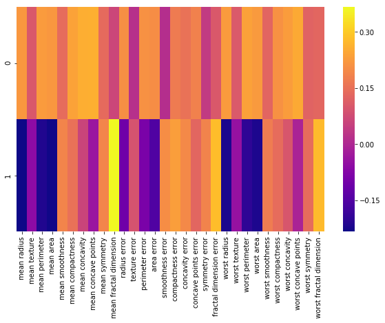
This heatmap and the color bar basically represent the correlation between the various feature and the principal component itself.